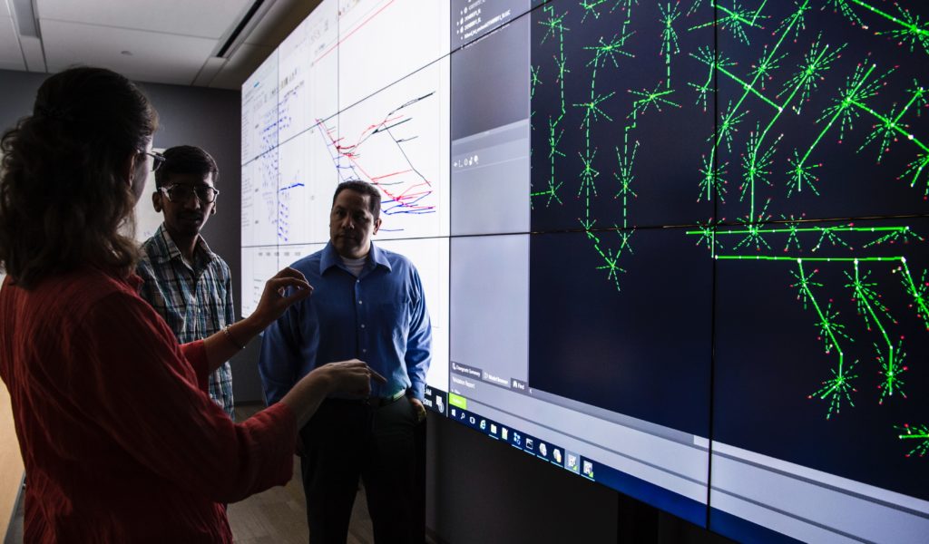
COVID-19 has highlighted the importance of timely and precise information for impactful decision-making. Because the pandemic was unprecedented, decision-makers often had to resort to trial and error to slow its spread. Effective risk management starts with a thorough understanding of likely scenarios. This not only requires clear data, the data also need to be presented in an accessible way. This is where simulations and visualisation tools can make a real difference.
Precise and comprehensible data is necessary to slow the spread of the virus. Information on the infection rates, incubation period or symptoms is essential to adopt effective measures against COVID. At the start of the pandemic, data on the mechanisms of this new viral strand was scarce and uncertain. Authorities had no choice but to use this limited data to develop strategies, resulting in sometimes ineffective strategies. Armed with a better understanding of the virus, scientists are better equipped to predict the short-term evolution of the virus. They still struggle to anticipate what the pandemic will look like in 6 months though, let alone in 6 years.
Even with solid scientific data, some knowledge might get lost in translation when scientists present their findings to decision-makers. The way data is presented plays a massive role in how they are understood and integrated in decision-making. The same research presented differently can inadvertently tell a different story, especially to lay audiences. Scientists need to be aware of
- who will be using their research and for which purposes
- how much background knowledge their audience has
- what type of information is useful in different contexts
More often than not, researchers assume all their readers have perfect data literacy. In fact, decision-makers are not necessarily familiar with the latest scientific techniques and new reporting methods. They might be used to seeing certain data represented in a very specific way. At the start of the COVID pandemic, for instance, many people, including some decision-makers, were confused by the logarithmic scale that is used to represent infection rates. This can lead to misinterpretation of the data and incorrect decision-making.

Data is essential for adaptation plans, yet data overkill can be a threat to effective decision-making. Bombarding authorities with big-picture, unspecialised data that is not directly relevant to their needs will not support their strategies. When it comes to climate mitigation, for instance, urban practitioners need high-resolution, localised data. While understanding that the global temperature might rise up to 4 or 5°C is important, this information is of little use to them if it is not translated into concrete consequences for their jurisdiction. This is why scientists should provide fit-for-purpose data that can readily be understood.
RECEIPT is helping stakeholders of different sectors understand long-term climate risks by using novel ways of communicating research. Our scientists are developing scientific climate risk storylines consisting of cause and effect chains to explore Europe’s vulnerabilities to remote climate impacts. A hurricane hitting the east coast of the US, for example, will not only have local impacts. Instead, its repercussions are likely to be felt in ports along the city’s major shipping routes, destabilising trade relations and supply chains globally. This will lead to cascading economic and social effects. Based on the specific information needed by sectors and institutions, our researchers translate the scientific storylines into coherent narratives. To make these narratives more tangible and accessible, we are developing an interactive visualisation tool that provides fit-for-purpose insights that can be understood by diverse non-scientific stakeholders. These tools can help our stakeholders and institutions be better prepared to face climate risks.
Find more information about climate scenarios and visualisation tools, as well as the lessons COVID-19 can teach Europe about climate preparedness in our joint policy brief.
Have a look at more bitesize content from the policy brief!
- All connected, all at risk – How COVID highlights the vulnerability of our global networks
- Defining the new normal – how our stakeholders are adapting their strategies after COVID-19
- COVID-19 and climate change: ‘Equalisers’ hitting vulnerable groups the hardest
- Global and compound crises: a challenge for decision-makers
Published on : 19 February 2021
